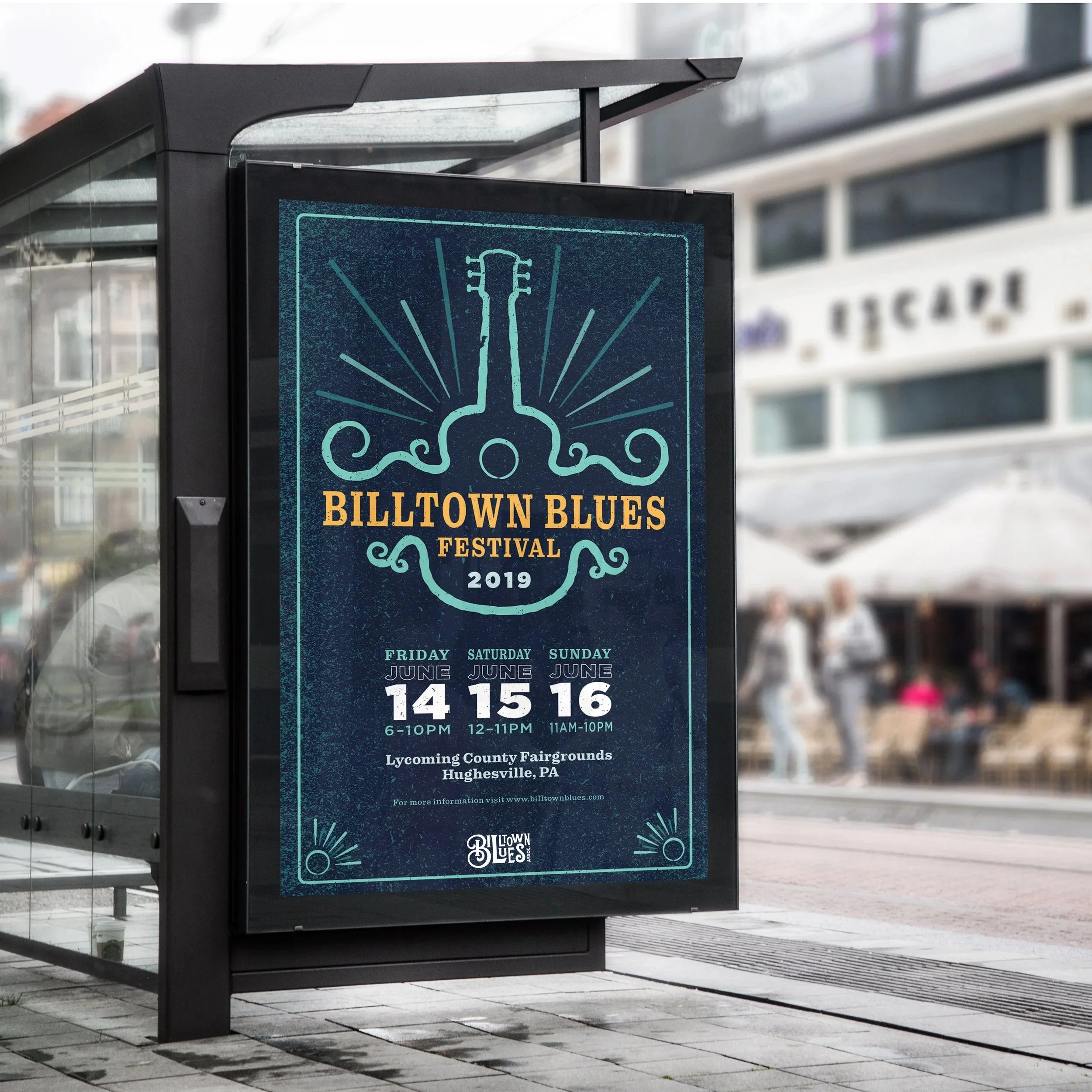
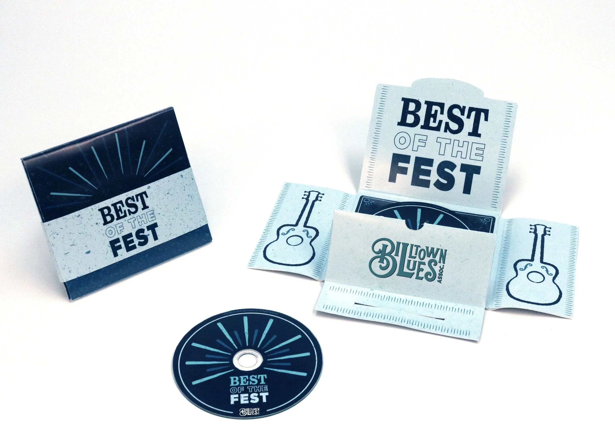
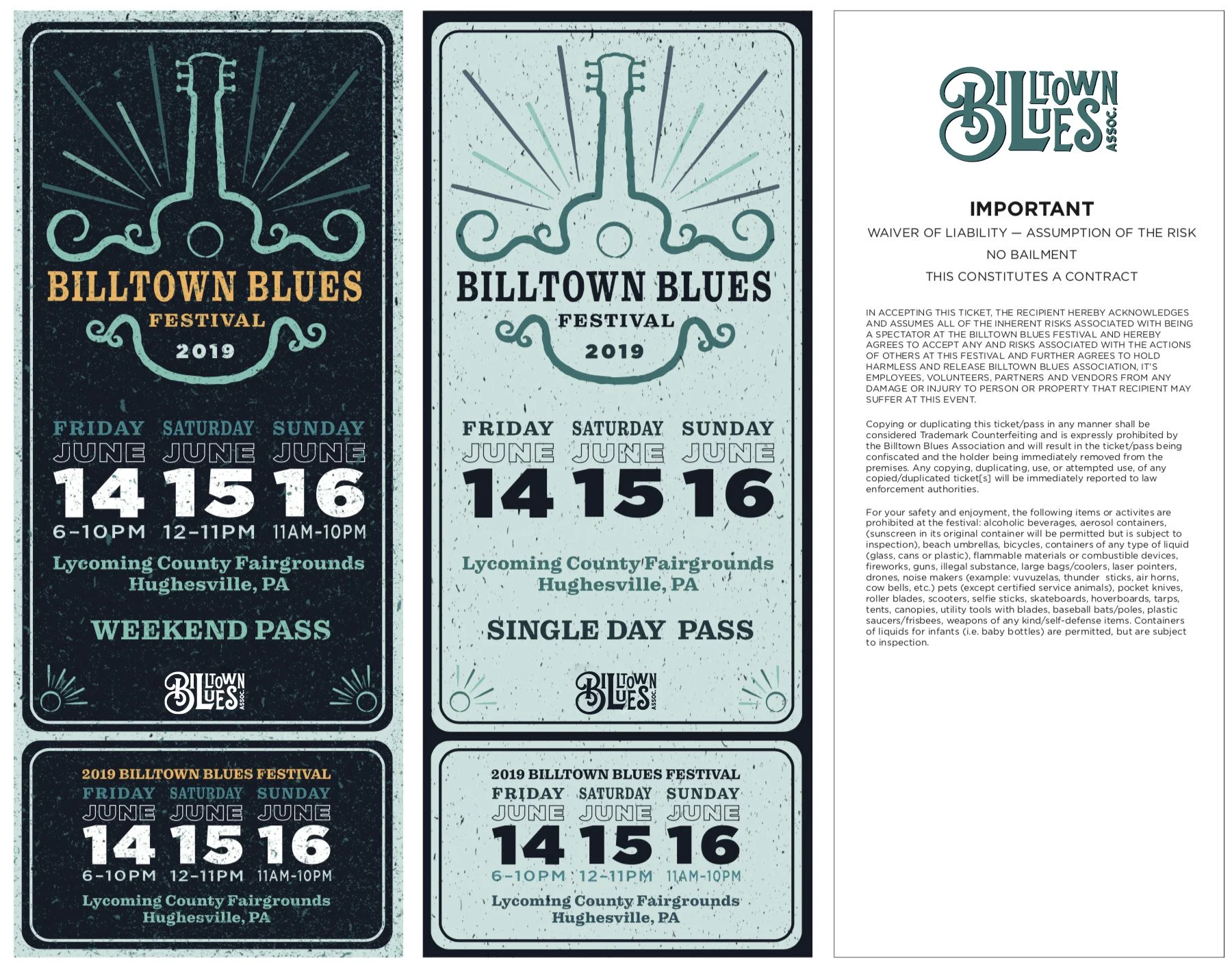
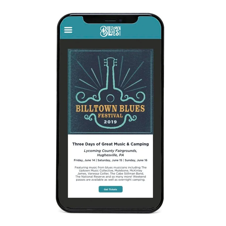
The Billtown Blues Association is a nonprofit organization based in Williamsport, PA. Their goal is to preserve Blues music as an art form that they can pass down to future generations by hosting a yearly blues festival. For my senior project, I designed a new logo featuring a hand-drawn B. I also delivered a poster, tickets, passes, a t-shirt, and a CD with packaging.
SCOPE: Branding | Illustration | Typography | Logo Design | App Design
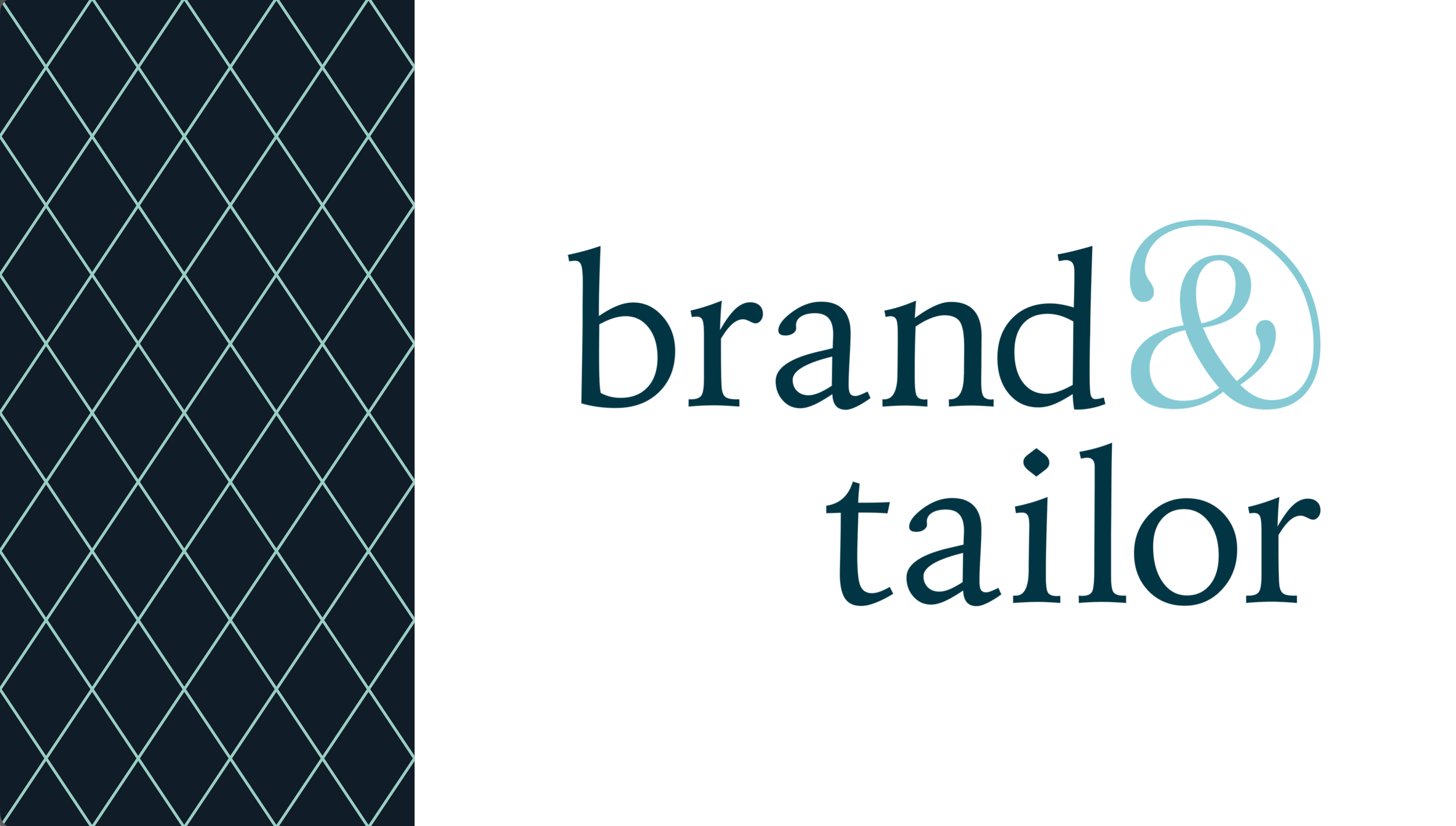
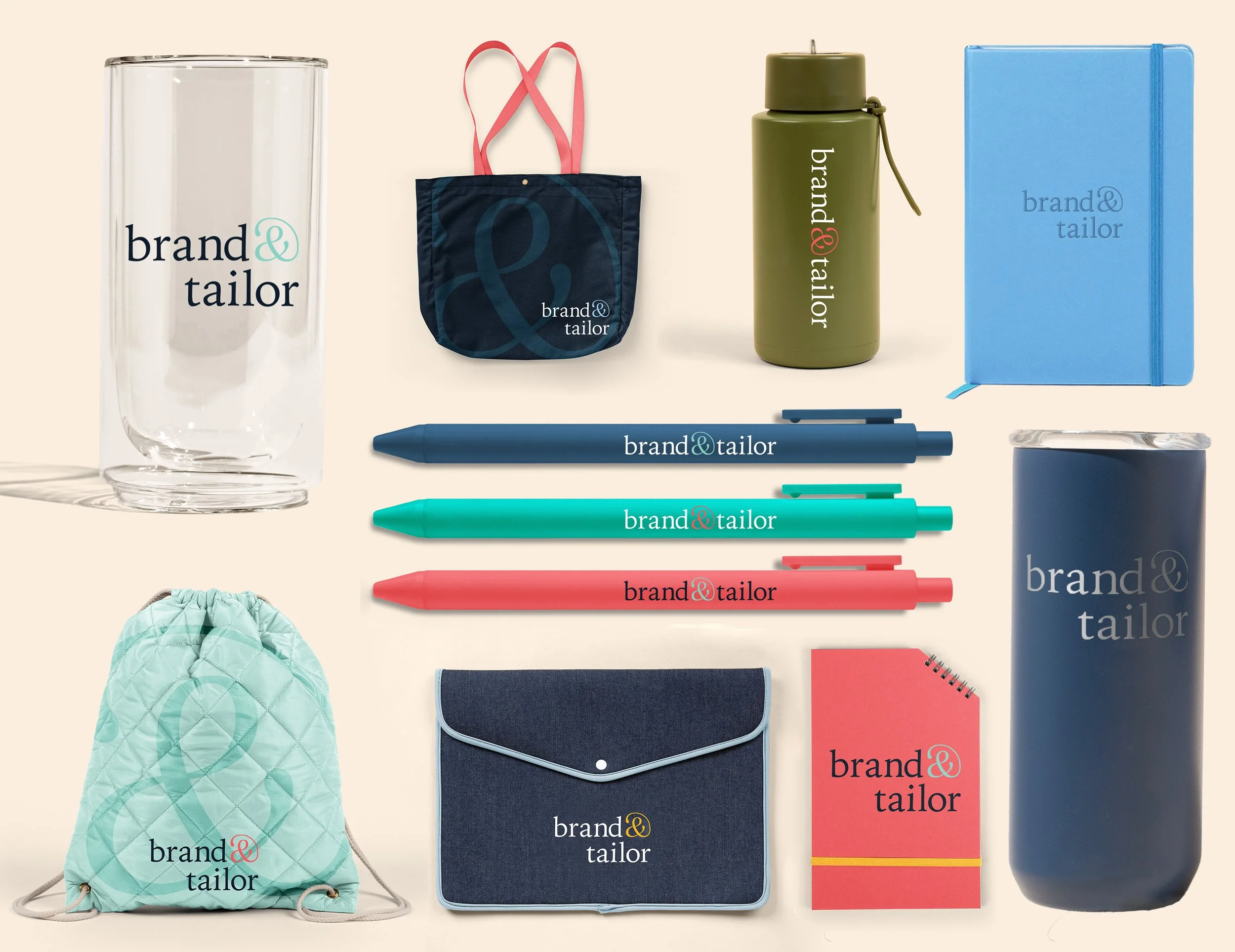
American Advertising Company is currently undergoing a brand change to the name Brand & Tailor. I was tasked with creating a completely new image for the new company. I delivered the logo and brand guidelines, and currently the website is in its final stages.
SCOPE: Branding | Logo Design | Typography | App Design | Color Theory
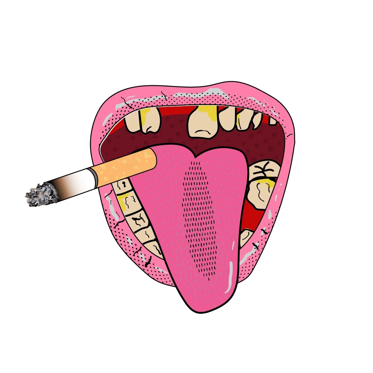
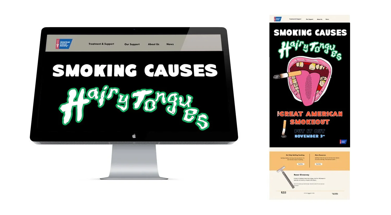
Every year, on the third Thursday of November, smokers across the nation take part in the American Cancer Society Great American Smokeout.
In our sophomore year, we were asked to design a microsite that explains the harmful effects of smoking and directs traffic back to the American Cancer Society's main site. My goal was to spread awareness of a lesser-known effect of smoking, hairy tongues. The main graphic was a hairy tongue and I created a grungey-looking hand-drawn type to use.
In addition to the microsite, I created a poster, a Snapchat ad, a Snapchat filter, and stickers.
SCOPE: Illustration | Typography | Branding | Web Design
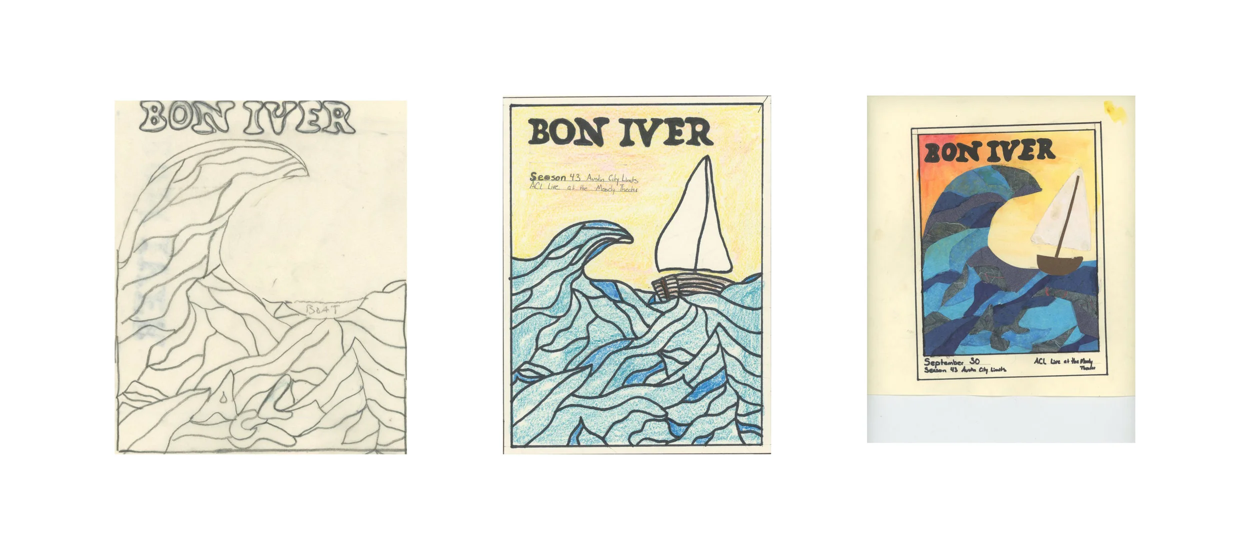
Bon Iver is an indie-folk band that was founded in 2006 by Justin Vernon. Bon Iver was a featured artist on Austin City Limits, the longest-running music series in television history.
This was a website and email made for the band. The poster was made of cut paper and watercolor with handmade type. It was then brought into Photoshop to fix little flaws and add the rest of the type.
SCOPE: Illustration | Typography | Branding | Color Theory | Photo Manipulation | Collage | Web Design
The email contains the main water graphic as the background and the type to create unity with the poster.
Here is the sketch colorized sketch. Then there was the rough comp where the actual hands on part started. The background is water color. The water and boat is made of overlapping hand cut pieces of various types of paper. Type at this point was just hand done sharpie. From this point it was scanned onto the computer and brought into photoshop where it was manipulated. The type was handmade on illustrator.
Adler Planetarium is America's first planetarium. Adler Planetarium is located in Chicago, Illinois. The planetarium is dedicated to astronomy and astrophysics.
Rather than use a common color palette of blues, or something expected, I experimented with a three-color purple, orange, and white color scheme. But I did keep the solar system in mind and carried spheres throughout the report, mimicking planets, while also incorporating pictures of planets to create the feeling of looking up into the night sky. I also designed a new logo for the planetarium that tied in the planets, curves, and colors that were in the design through the report.
SCOPE: Branding | Illustration | Photo Manipulation | Layout | Typography | Logo Design
These are some of my favorite logos that I have done throughout college and in my free time as passion projects. These use a variety of types, colors, and stylistic approaches. Some have corresponding projects while others were speed problems done in less than a day.
SCOPE: Logo Design | Illustration | Typography | Branding | Color Theory
Posters are one of my favorite things to design. For as far back as I can remember, I have been drawn to posters. I find it fascinating that with just a flat piece of paper, some ink, and creativity, you can create something different every time. There’s magic in there somewhere.
The Spirit Coalition-
This was a suicide prevention campaign I created in a senior-level class. I created the logo located at the bottom left of the poster. I also created stationery, and an Instagram ad campaign (not pictured). The poster was my favorite piece. I wanted to create a visual piece that would appeal to demographics of all ages, not one specific age or gender. Help should be available to everyone, no matter what.
Art Brothers-
Everybody loves a good mashup. In my freshman year, I created a poster that combines two artists; Saul Bass and Shigeo Fukuda's art. It displays Bass's notorious Blues Brothers look while showcasing Fukuda's amazing typography which I recreated by hand.
Billtown Flea-
This was a speed problem where I was given one day to create a poster for a fictitious flea market. I wanted a vintage look with a color palette I do not normally use. I manipulated a photo of a typewriter to get the green hue to match the rest of my poster. I enjoy vintage ads from the 50’s and was trying to emulate that here.
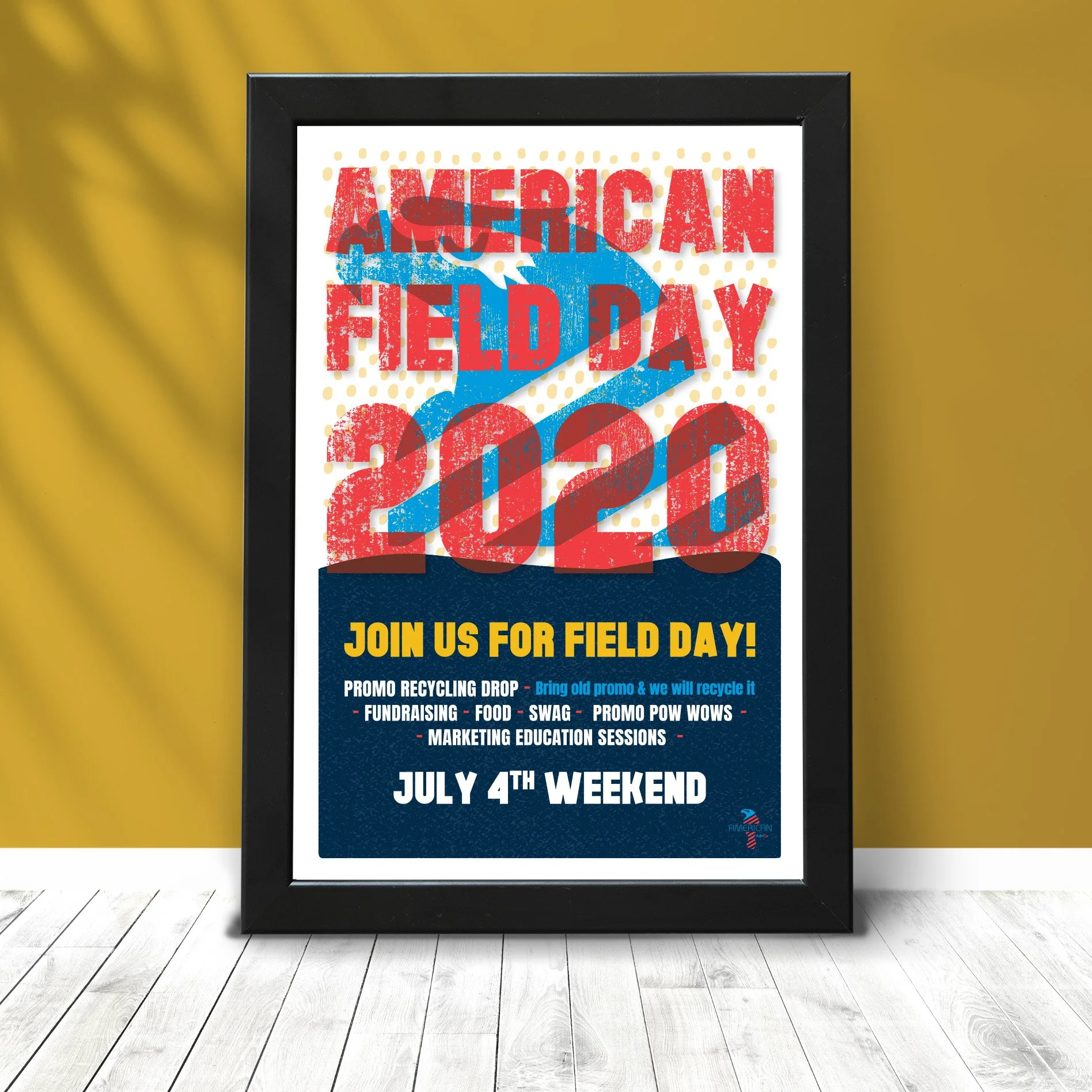
American Field Day-
This was a poster on which I was given full artistic freedom. America is big and bold, so I chose a font to really show that off. I wanted to show the fun of the day while also showing we were going to get down to the nitty-gritty.
Textures and gradients are not something I can use often, since most of our products are screen-printed, but this being a four-color process really let me play.
SCOPE: Illustration | Typography | Branding | Color Theory | Photo Manipulation
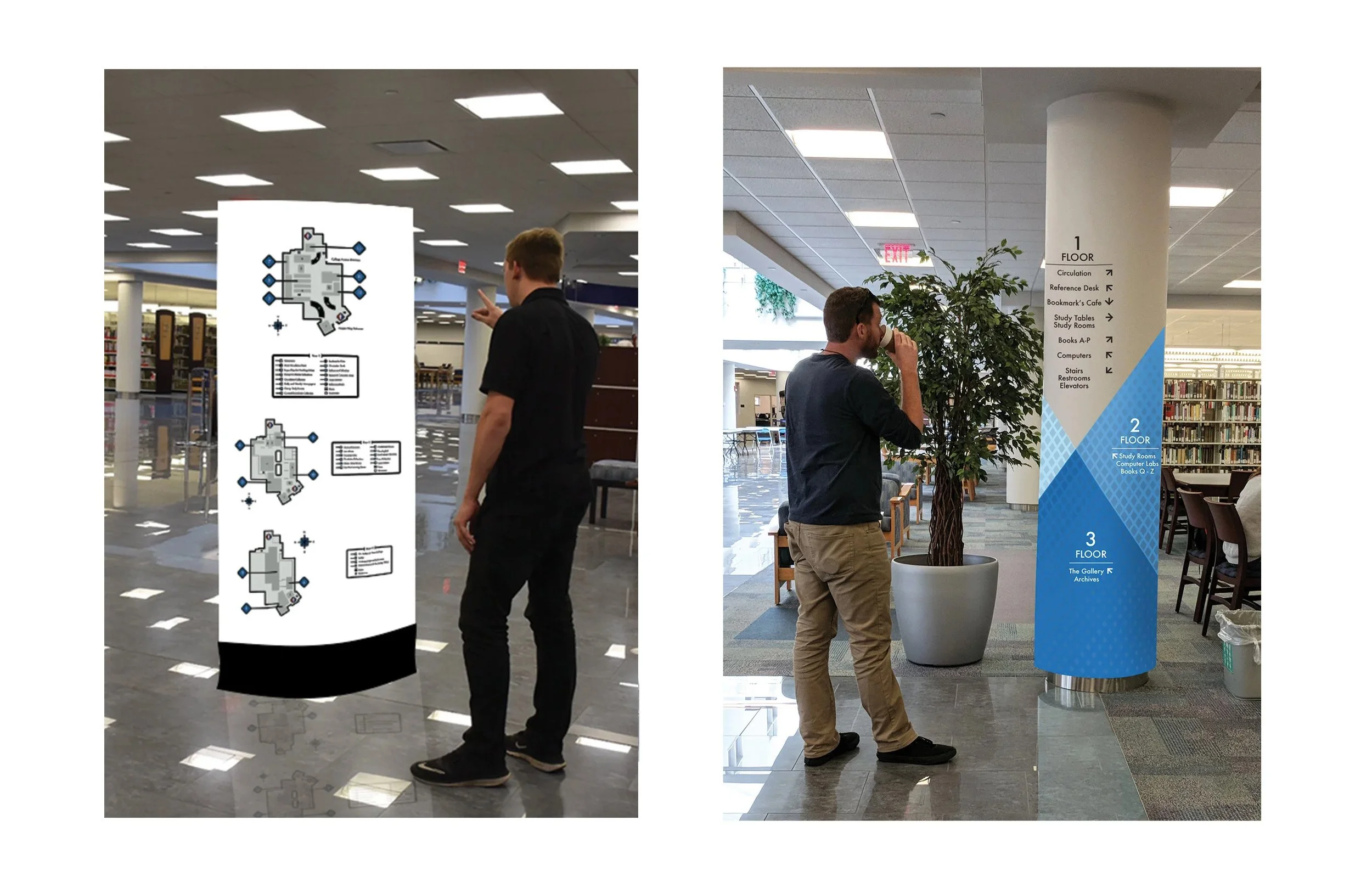
For a junior-level class, I was challenged to design deliverables for the library. I created symbols for the degrees displayed in the showcases throughout the library, a directory, and a map for all three floors. My map design was chosen at the end to be printed and used in the library as well as in welcome packets for incoming freshmen.
The symbols feature a thick monoline design. The degrees I created symbols for are:
Science, Digital Marketing, Business, Welding, Culinary and Health Sciences.
The directory uses Penn College blue. Around the library, 4 boxes are repeated, so I took it and turned it to make a dynamic line, then put a texture of repeating box gradients I made onto the turned box.
Instead of adding to the library, I used the columns that were already there to place my directory on using vinyl stickers, however, the third floor did not have the column so I turned it sideways and made a hanging sign to unify the designs.
The map uses the thick line from the symbols and the squares and colors from the directory. It would be placed on the wall as vinyl and also be a brochure that could be used to navigate through the library.
SCOPE: Illustration | Typography | Branding | Color Theory | Photo Manipulation
I was challenged to rebrand a company called Two Ravens Chocolate. I came up with a completely new name, Clair De Lune, which means by the light of the moon. My aim here was for a high-class packaging and to give the feeling you get from gazing at the stars, the feeling of mysticism and wonder. I manipulated photographs with a solarized effect on them and added bold typography.
SCOPE: Logo Design | Typography | Branding | Color Theory | Photo Manipulation
I created beer packaging in a linocut-esque design for Edgar Allen Poe’s work. I hand drew all of the work, as well as having to figure out dielines for the first time and construct my box by hand.
Freshman year we were given a fake pizza or donut shop and then challenged to create a logo in one class period. Then we took that logo and developed it out into a whole brand package for the packaging for the place.